Features
This theme is built on the Warp framework, a well-engineered theme framework for WordPress and Joomla, and utilizes all of its latest features. The user interface is powered by UIkit, a lightweight and modular front-end framework, which provides the theme’s styling. The theme also comes with a wide range of different layouts and widget variations.
Styles
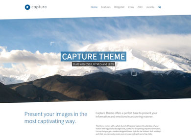
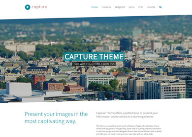
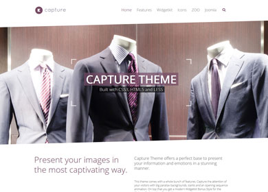
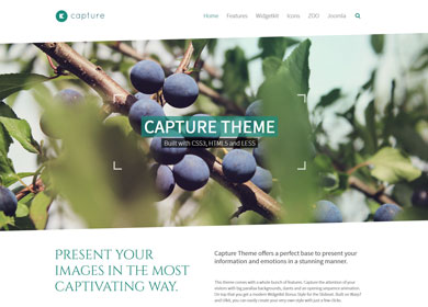
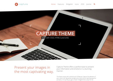
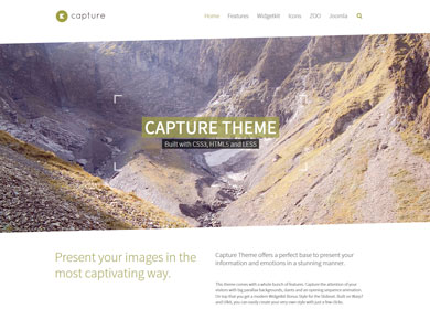
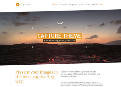
We provide lovingly crafted style variations to give you a glimpse of what is possible with this theme. The built-in theme customizer allows you to modify colors, fonts, sizes and much more without any CSS knowledge. Just choose your colors with the color picker and adjust the theme with only a few clicks. Click on one of the images to see the style.
Parallax
To use our unique parallax effect, just add the .parallax class to a <div> element and modify it the way you want with the data-* attributes.
| Syntax name | Description | Default value |
|---|---|---|
data-sizeratio="" |
Defines the height in relation to the width. | 0.38 |
data-ratio="" |
Defines the effect speed. The higher the value, the more slower the effect speed. "1" is the natural scroll speed. |
8 |
data-maxdiff="" |
Defines a maximal scroll height. | false |
data-start="" |
Defines a starting position. | 0 |
data-mode="" |
Defines, when the parallax effects begins. "inview" starts once the parallax is in view of the browser frame. "dock" starts when the browser frame top docks to the parallax. |
inview |
data-childanimation="" |
Defines, if the child element is animated with "true" or "false". |
true |
data-childdir="" |
Defines the direction of child elements. "-1" will scroll to top. "1" will scroll to bottom. |
1 |
data-childratio="" |
Defines the speed of child elements. "-1" will scroll to top. "1" will scroll to bottom. |
3 |
data-childopacity="" |
Adds or removes a fade-out effect from child elements by using the value "true" or "false". |
true |
Parallax example
<div class="parallax" id="parallax-top-image" data-childopacity="false" data-sizeratio="0.12" data-childdir="1">
   <div>This is the child element</div>
</div>
Custom Widgetkit Styles
We created a custom style for our Widgetkit Slideset, perfectly fitting the theme. To apply this style, follow these steps:
Slideset
- Download and unzip the bonus styles package for Widgetkit available in the download area
- Copy the folder slideset/styles/capture
- Joomla: Paste it to media/widgetkit/widgets/slideset/styles
WordPress: Paste it to wp-content/plugins/widgetkit/widgets/slideset/styles - Now you can select the style “Capture” in the settings of your Widgetkit Slideset
Social Icons
Use the modifier .uk-icon-button class to create an icon button.
Here is a little code example how to add them:
  <a href="#" class="uk-icon-button uk-icon-twitter"></a>
  <a href="#" class="uk-icon-button uk-icon-facebook"></a>
  <a href="#" class="uk-icon-button uk-icon-google-plus"></a>
Here is an overview of all icons provided by Font Awesome.
